Angles
Have you thought about how an image of your workplace, town, or another building on your website can be used in your marketing? Angles can change the perspective and look of an image quite markedly. Do you know how to capture your environment in the best way possible.
There are many iconic buildings, perhaps there is one nearby your own workplace. But, why do these buildings gain such prominence?
Sometimes it is the design, whether this be good, bad or ugly.
Beauty is also in the eye of the beholder. No matter the building you might be working from, living in, or designing, whether it be geometric shapes and lines, or something more imprecise, photographs can create a buzz.
The Place of Drama.
The Olympics and Para-Olympics in London were a great success, on many fronts. The medal count for Team GB was significant, but so were the stadia.
One of these theatres that is still in use, and standing is the Velodrome.
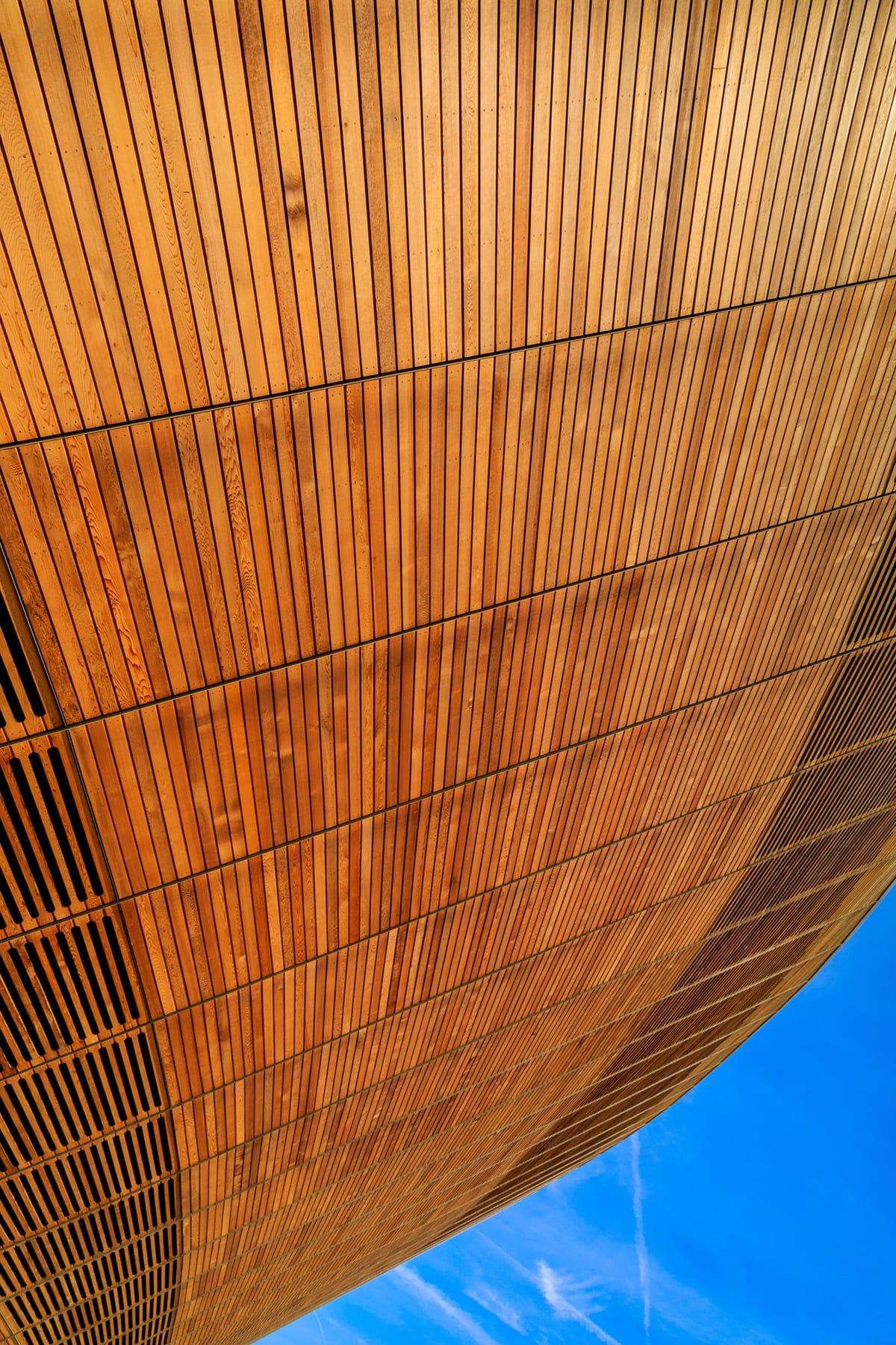
During an out door cycling event. I was captivated by the sweeping design and the material used. I lay on my back and shot upwards.
London Velodrome – by Arwyn Bailey

Upwards is Different – Part I.
Standing upright for this shot means that the resulting image will have been exactly the same as many millions of other shots.
Furthermore, the paths around the velodrome are rarely empty.
Showcasing architecture with a lot of people around it can be relevant to the subject.
Getting a clear shot to emphasise the lines and contours of the building is what I gained in this photograph.
Angles – Part I.
Using a more unusual version of leading lines in this image creates something that is different.
They lead around and downwards instead of moving upwards.
Contrast – Part I.
Included within the image is a piece of sky at the bottom of the image as a bright contrast.
This helps to lift the image up and toward the front of the frame.
Warmth and Tone – Part I.
The colour of the wood is a reassuring colour.
It reflects the gold of medals, and the warm feeling one might get when recalling the successes of our Olympians and Para-Olympians on home soil.
This is why I have rendered the image with this range of tones, though, they are fairly realistic and close to reality upon a bright sunny day.
Curves – Part I.
This building is curved. It is a reflection of the track within the Velodrome, and cyclists whoosing by as they disturb the air.
The Theatre.
Theatres are as iconic as any building that hosts workers. They are part of the experience of visiting the theatre to see a performance.
Theatres are part of the performances themselves.
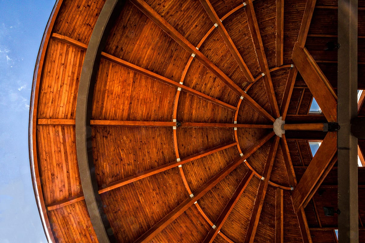
When visiting Chile and the town of Frutillar, I took some shots of a beautiful building that is a theatre where many famous orchestras and other performers have graced the stage.

Teatro Del Lago Frutillar Chile – by Arwyn Bailey
Upwards is Different – Part II
As with the Velodrome, in London, wood has been used in this construction.
The lines in this image are different again.
A wooden canopy over the entrance is a beautiful piece of architecture.
Again, I am lying on my back, shooting directly upwards.
This angle captures the curve of the roof perfectly. This is lost when shot from a vertical position and angled upwards. Yet, this is precisely how the majority of visitors shoot this building.
Contrast – Part II.
Once again, I have included a piece of sky within this image as a splash of colour
This helps to showcase the curve of canopy perfectly.
Warmth and Tone – Part II.
The colour of the wood is, in reality, more grainy and slightly harsher.
This is why I have rendered the image with a harsher grain which reflects both the harmony and harshness of the performances that take place within this building.
Curves – Part II.
The canopy is what I wished to emphasise in this shot.
I also aimed to highlight the sharp lines of the beams going across the roof, yet, they are reconciled with curved beams.
This is genius by the architect.
The Beehive at Kew.
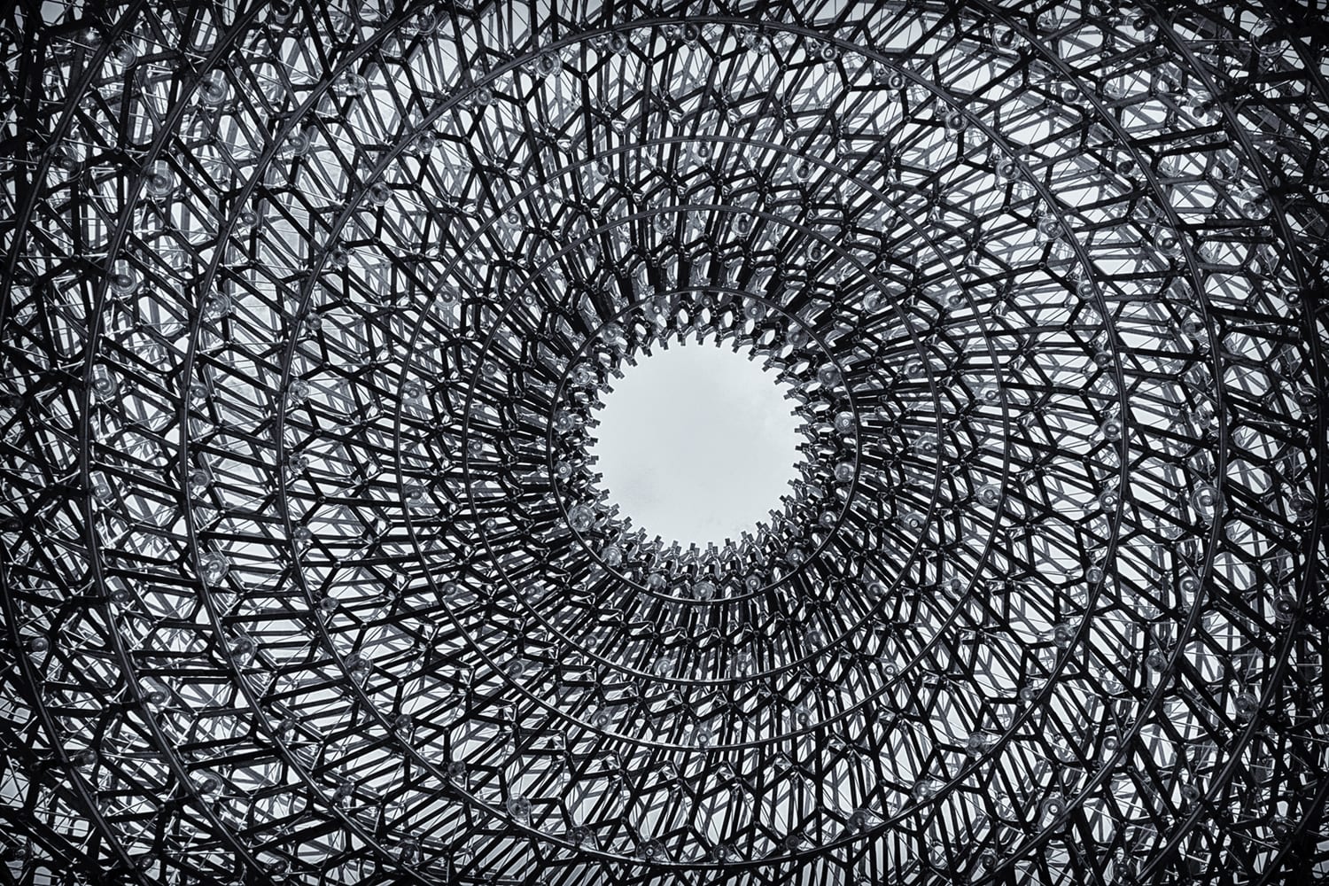
This installation at Kew Botanical Gardens is art, nature and architecture combined.
The structure is built in a spiral, as a beehive in nature is constructed.

The Beehive in Kew – by Arwyn Bailey
Upwards is Different – Part III
As one can imagine this structure is often packed with visitors.
Gaining an unobscured view in order to showcase this work is problematic, unless… you got it, one lies one one’s back.
One needs to be careful that one is not accused of taking inappropriate photographs though. Have someone on lookout for you.
Contrast – Part III.
In this image, the means of gaining a contrast is found in black and white.
There is little sky to be seen, therefore not much to be used.
Warmth and Tone – Part III.
But, by treating the image with a silvery metallic tone, contrast is gained, but I have not pushed this too much.
By refraining from a dramatic contrast, there is still a warmth to the image.
Curves – Part III.
The curves are a spiral.
Standing vertically one cannot capture this spiral.
It is only by shooting upwards that the spiral can be observed.
I am probably one. of the very few people, from anywhere in the world, who has shot this work from this angle.
Iconic Buildings.
Many buildings are iconic. They have a certain look and feel about them. They engender emotions with the viewer.
Here is one such building, which is one of my favourite works of architecture.
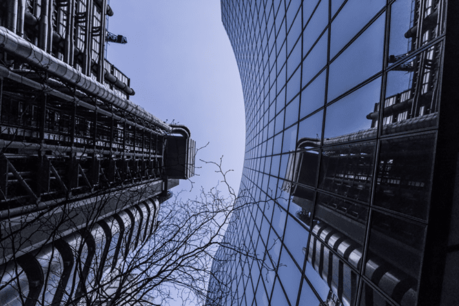
The Lloyds Building in London is one of the best in the U.K.

Lloyds of London – by Arwyn Bailey
Upwards is Different – Part IV.
Tis building is beset by a different set of problems. It has a number of other buildings surrounding it.
Gaining a clear shot is very difficult.
Guess what I did? I was on my back, shooting upwards.
Although the neighbouring building was captured within the shot, this curve of the building opposite is a great contrast to the sharper lines of the Lloyds Building.
Contrast – Part IV.
Taking the colour down in this image has retained a colour tone that is blue and metallic.
Warmth and Tone – Part IV.
The reflection of the iconic Lloyds Building helps to create an image that says that the one building is more dominating than its neighbour.
By treating the image with a silvery metallic tone, contrast is gained, but I have not pushed this too much.
By refraining from a dramatic contrast, there is still a warmth to the image.
Curves – Part IV.
The curves on the one building are a great contrast to the iconic nature of Lloyds.
Being Technical.
The Smartphone device has created a democracy and accessibility to imagery.
However, such a modern device has not (yet) negated the need for experience and creativity, and skill.
Shooting these buildings was challenging to my creative juices, but, they reflect the nature of each piece of architecture.
Likewise, within business, there are occasions when your own mobile device will suffice, but, on other occasions a professional is required to produce the images that will create a lasting impression, and gain traction fro you and your business.
Get in Touch.
The services that I provide, to you, provides you with media that is impactful and designed to create a response.
Tapping into my experience starts by you contacting me via my contact page by clicking here for a no obligation conversation.
Also, you can learn more about me by viewing my YouTube Channel that can be found by clicking here.
You can review the services that I offer to you, within a safe environment during this COVID-19 situation.
Start planning your own marketing endeavours with me.
Lord Pennington-Bailey, Arwyn, of Hougun Manor.
